Wall of Encouragement public activation
Installing Make Something Edmonton’s message ~ 2016
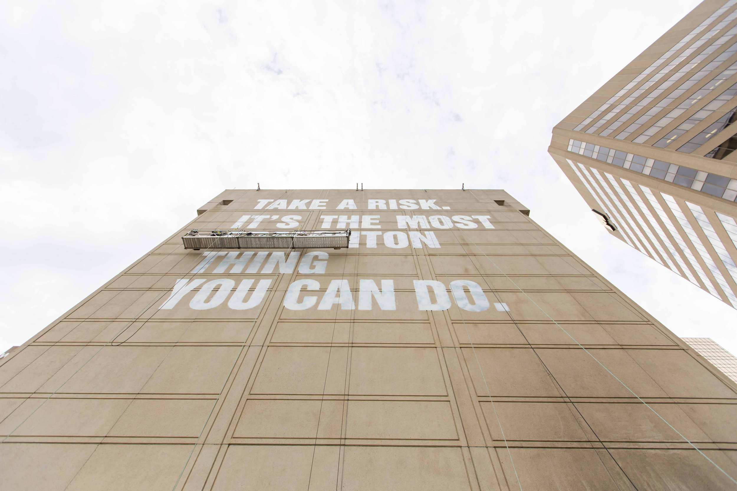
Aspiring to build a distinctly Edmonton brand, the now-defunct Make Something Edmonton (MSE) wrote and designed the massive Take A Risk message. Ambitious to go big and publicly launch their "Messages of Encouragement" they approached CLD to fabricate gigantic letters and devise an installation 40m (~130ft) high onto a concrete firewall facing Edmonton's City Hall.
Their encouraging messages contained sentiments or attitudes they believed expressed "Edmonton-ness." Designed in Helvetica Bold Condensed, some included—What are you making? How can we help?—Five minutes here and you're one of us.—Some cities are finished, others you can change.—Take a risk. It's the most Edmonton thing you can do.
Make Something Edmonton intended to publicly activate its encouraging messages throughout downtown in various ways, places and scales. A place-brand strategy they called "Encourage" formed the basis of their communications effort, and CLD was asked to craft and install (what they planned to be) the first of many. MSE retains full credit for its campaign's strategy, writing, location, and design.
Visit the Make Something Edmonton archive page to learn more and listen to CBC reporter Clare Bonnyman's new podcast This Is Edmonton to hear more from me on this project and about art and design with David Turnbull, public art director at the Edmonton Arts Council.
Figure 1. Make Something Edmonton’s Only In Edmonton, Wall Project brand summary and creative brief. (2016)
Figure 2. (Detail) Make Something Edmonton’s “What are you making? How can we help? Supplied visual mock-up (2016)
Make Something Edmonton’s “ENCOURAGE” book includes written and photographic essays and observations that document and explore cultural and community experiences in Edmonton.
Make Something Edmonton’s branding and design guidelines “THE WORLD NEEDS MORE EDMONTON” included strategy and instructions for applying their written and visual branding assets.
How the wall got started.
Their aspiration to express "Edmonton-ness" interested me. Statements like "Some cities are finished. Others you can change." and "What are you making? How can we help?"—brought forth inclusion and invited participation in the City in new or emerging ways while celebrating good things already happening here. Make Something Edmonton intended to activate public space with their messages, a bit like an advertising campaign, but different by involving local artists and makers to embolden E-town's vibe and grassroots DIY efforts.
The Make Something Edmonton creative team, building owner (Melcor) and their working group arrived at "Take A Risk. It's the Most Edmonton Thing You Can Do." This text was not my first choice, and I pointed to alternatives from their collection. CLD was tasked to make and install the letters, not choose the message to become the first of many installations. That said, I reminded the working group to consider the complexity of presenting any message (particularly a didactic one) about Edmonton in the public realm at this scale—which can (and did) generate hot debate.
How the message was installed.
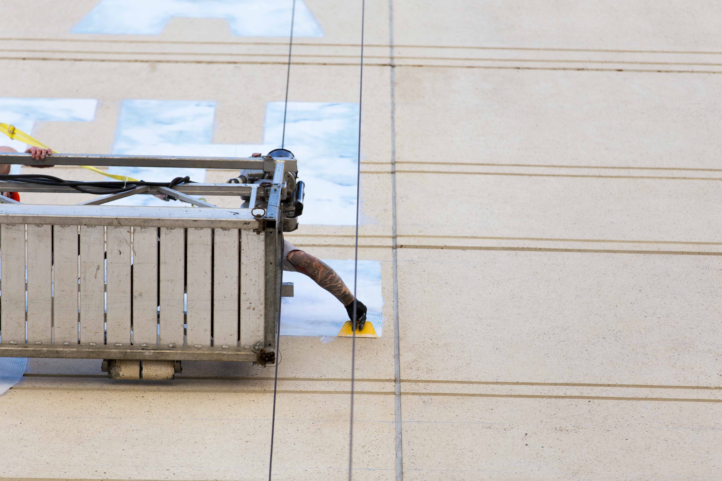
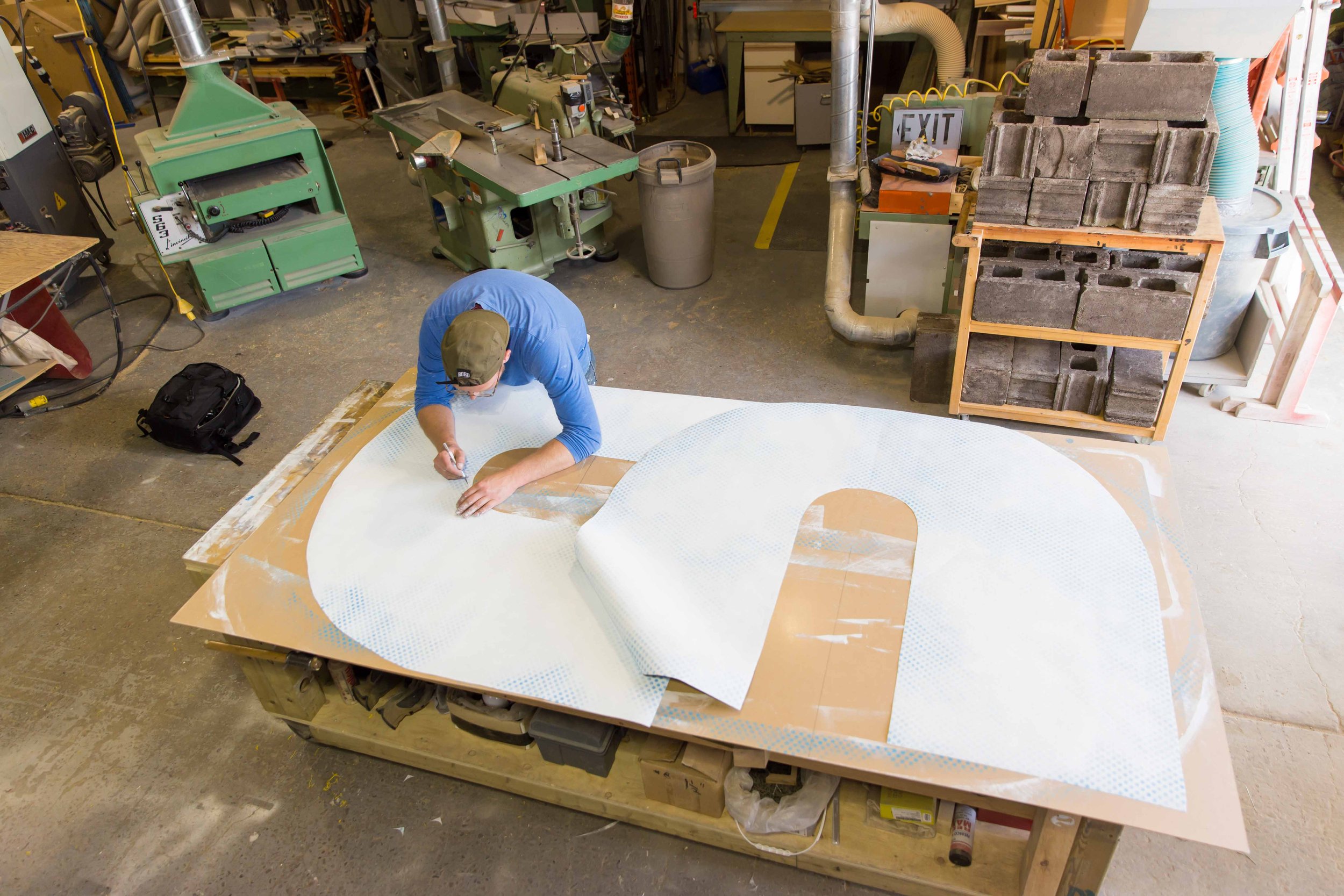
Locally acclaimed Edmonton graffiti artist Evan Rast and I plotted a grid and installed all 40+ characters early that summer in just two weeks. Edmonton is notorious for gusty thunderstorms, and we worked safely harnessed from two elevated platforms supported from the top of the building. We sliced all the letters laterally and carefully aligned each piece to our own measurements—then laminated them one by one to the aggregate surface suspended along the building well over 40 meters high. All without any available architectural drawings.
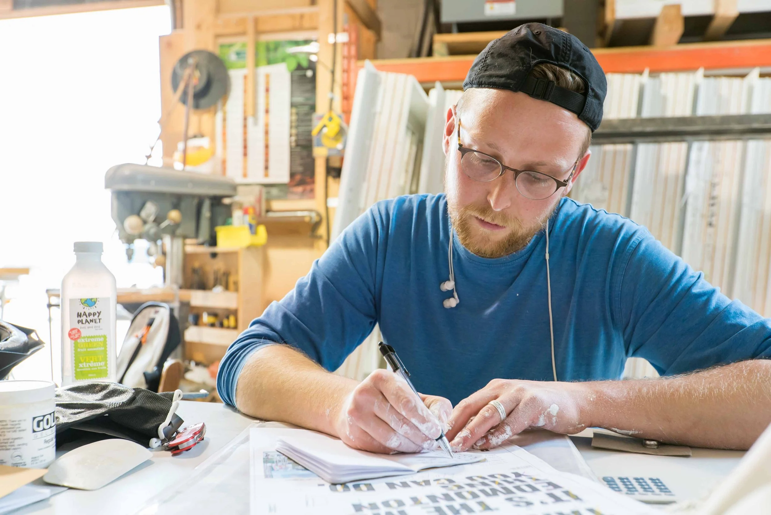
For those readers who are also lettering designers or typographers—this was by far the largest kerning-to-letter pair ratio I have ever resolved. Getting a jpeg of a visual mockup is one thing. Making letters work at this scale is another.
Access was from the adjacent roof. Evan Rast & CLD bring the two swing stages into operation
Massive letters shown with the Downtown Public Library that has since been completely redeveloped
Rast and CLD installing letters that stood well above our heads
CLD working at base of lettering above adjacent building
We snapped our own level grid, sliced and aligned the centres of each letter
Evan Rast's reaches to apply material that lands between the two swing stages
Rast & CLD hand-apply clear UV MSA varnish onto the letters. The aggregate concrete could not be painted/coated
Once the reveals between concrete were trimmed a siloxane sealant was hand applied to every trimmed edge
Each of the two swing stages were over 9m (30 ft) wide. We moved installation from left to right on each side
The blue pattern CLD painted into each letter is inspired by our ever changing Edmonton sky. CLD envisioned the effect to appear as looking directly through the building
As a firewall the adjacent property may one day be redeveloped and block the message


